This analysis is done using an online retail dataset that was downloaded from UCI Machine Learning Repository.
Start by importing our libraries and then loading the data.
# import libraries
import datetime as dt
import pandas as pd
import numpy as np

# ML models
from fbprophet import Prophet
from sklearn.metrics import mean_squared_error, r2_score, mean_absolute_error

# never print matching warnings
import warnings
warnings.filterwarnings('ignore')

# classic division semantics in a module
from __future__ import division

#for data visualization
import plotly.offline as pyoff
from plotly.offline import download_plotlyjs, init_notebook_mode, plot, iplot
import plotly.graph_objs as go
import seaborn as sns
%matplotlib inline
import matplotlib.pyplot as plt

# initiate the Plotly Notebook mode to use plotly offline
init_notebook_mode(connected=True)
data = pd.read_csv('OnlineRetail.csv',header=0, encoding = 'unicode_escape')
data.tail()
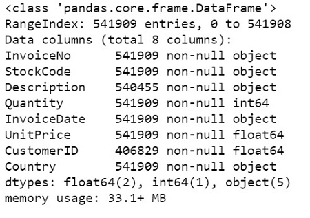
Check the full summary to see if cleaning is needed and what explore what tytpes are in this dataset.
data.info()
Removed all the nulls, dups and negative values. Now convert InvoiceDate to datetime from string and add in InvoicePeriod to determine invoice month.
retail_data['InvoiceDate'] = pd.to_datetime(retail_data['InvoiceDate'])
retail_data['InvoicePeriod'] = retail_data['InvoiceDate'].map(lambda x: x.strftime('%Y-%m'))
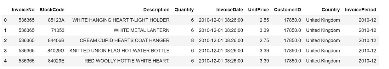
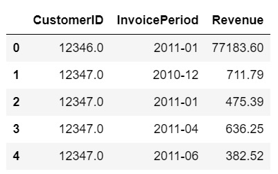
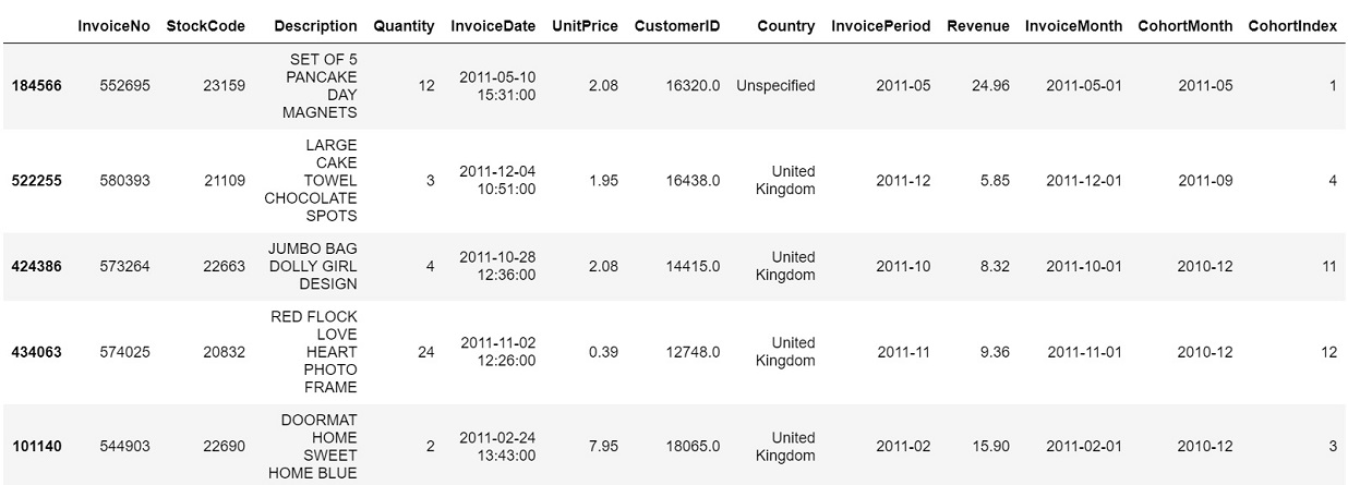
retail_data.head()
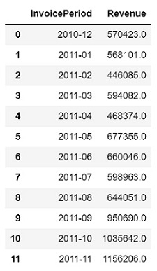
Calculate monthly revenue and create a new dataframe with InvoicePeriod and Revenue columns.
retail_data['Revenue'] = retail_data['UnitPrice'] * retail_data['Quantity']
retail_revenue = retail_data.groupby(['InvoicePeriod'])['Revenue'].sum().round().reset_index()
revenue = retail_revenue.drop(retail_revenue.index[12])
revenue
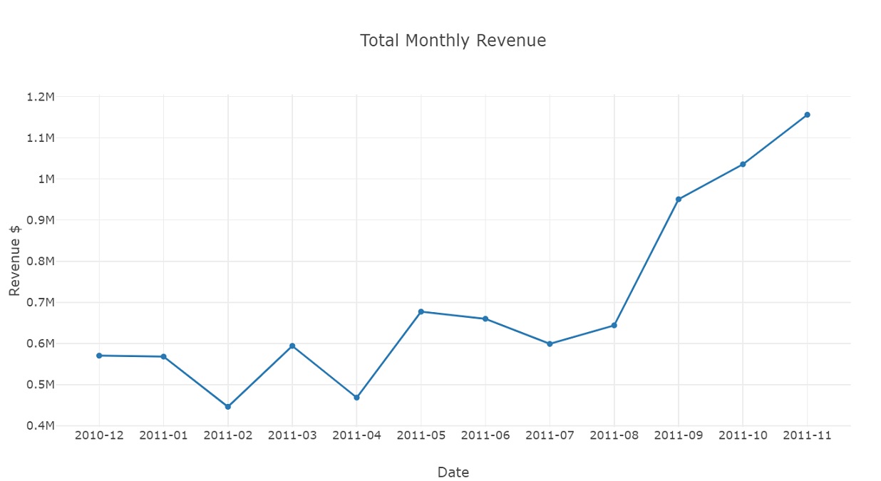
Graph monthly revenue.
revenue_data = [go.Scatter(x = revenue['InvoicePeriod'],
y = revenue['Revenue'])]

plot_layout = go.Layout(xaxis = dict(title = 'Date', type = 'category'),
yaxis = {'title':'Revenue $'},
title = 'Total Monthly Revenue')

fig = go.Figure(data = revenue_data, layout = plot_layout)
pyoff.iplot(fig)
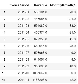
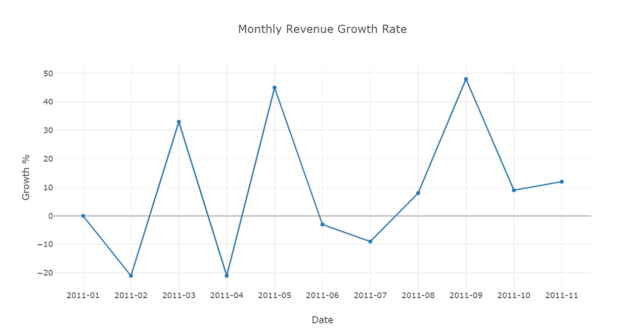
Calculate monthly revenue growth rate using pct_change() function to see monthly percentage change.
revenue['MonthlyGrowth%'] = (retail_revenue['Revenue'].pct_change()*100).round()
growth = revenue.dropna()
growth
Graph monthly revenue growth rate.
mrg_data = [go.Scatter(x = growth['InvoicePeriod'],
		       y = growth['MonthlyGrowth%'])]

plot_layout = go.Layout(xaxis = dict(title = 'Date', type = 'category'),
			yaxis = {'title':'Growth %'},
			title = 'Monthly Revenue Growth Rate')

fig = go.Figure(data = mrg_data, layout=plot_layout)
pyoff.iplot(fig)
Now let's take a closer look at the customers.
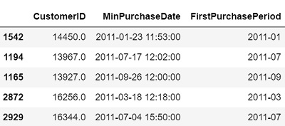
Groupby customer ID and using the .min() function to find customers' first purchase date based on InvoiceDate coloumn and created a dataframe contaning CustomerID and first purchase date
min_purchase = retail_data.groupby('CustomerID').InvoiceDate.min().reset_index()
min_purchase.columns = ['CustomerID','MinPurchaseDate']
min_purchase['FirstPurchasePeriod'] = min_purchase['MinPurchaseDate'].map(lambda x: x.strftime('%Y-%m'))
min_purchase.sample(5)
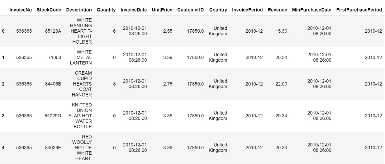
Now merge first purchase date column to main dataframe.
first_purchase = pd.merge(retail_data, min_purchase, on = 'CustomerID')
first_purchase.head()
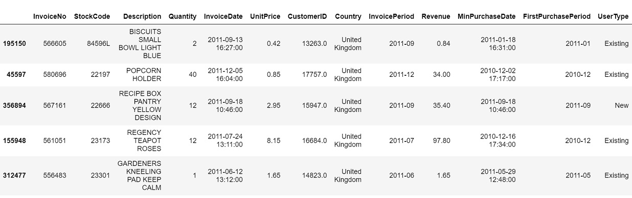
Create a column called UserType and assign New or Existing. If customer's invoice period is greater then the first purchase then they are a returning customer.
first_purchase['UserType'] = 'New'
first_purchase.loc[first_purchase['InvoicePeriod'] > first_purchase['FirstPurchasePeriod'],'UserType'] = 'Existing'
first_purchase.sample(5)
Create a dataframe with Revenue per month for each user type
user_type_revenue = first_purchase.groupby(['InvoicePeriod', 'UserType'])['Revenue'].sum().round().reset_index()
user_type_revenue = user_type_revenue.drop(user_type_revenue.index[[0,23,24]])
user_type_revenue
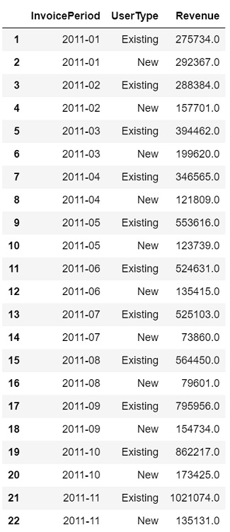
Graph new and existing customers revenue each month. Existing customers account for most of the revenue.
ne_data = [go.Scatter(x = user_type_revenue.query("UserType == 'Existing'")['InvoicePeriod'],
		      y = user_type_revenue.query("UserType == 'Existing'")['Revenue'], name = 'Existing'),

	   go.Scatter(x = user_type_revenue.query("UserType == 'New'")['InvoicePeriod'],
		      y = user_type_revenue.query("UserType == 'New'")['Revenue'], name = 'New')]

plot_layout = go.Layout(xaxis = dict(title='Date', type='category'),
			yaxis = {'title':'Revenue $'},
			title = 'New vs. Existing Customer Revenue Comparison')

fig = go.Figure(data = ne_data, layout=plot_layout)
pyoff.iplot(fig)
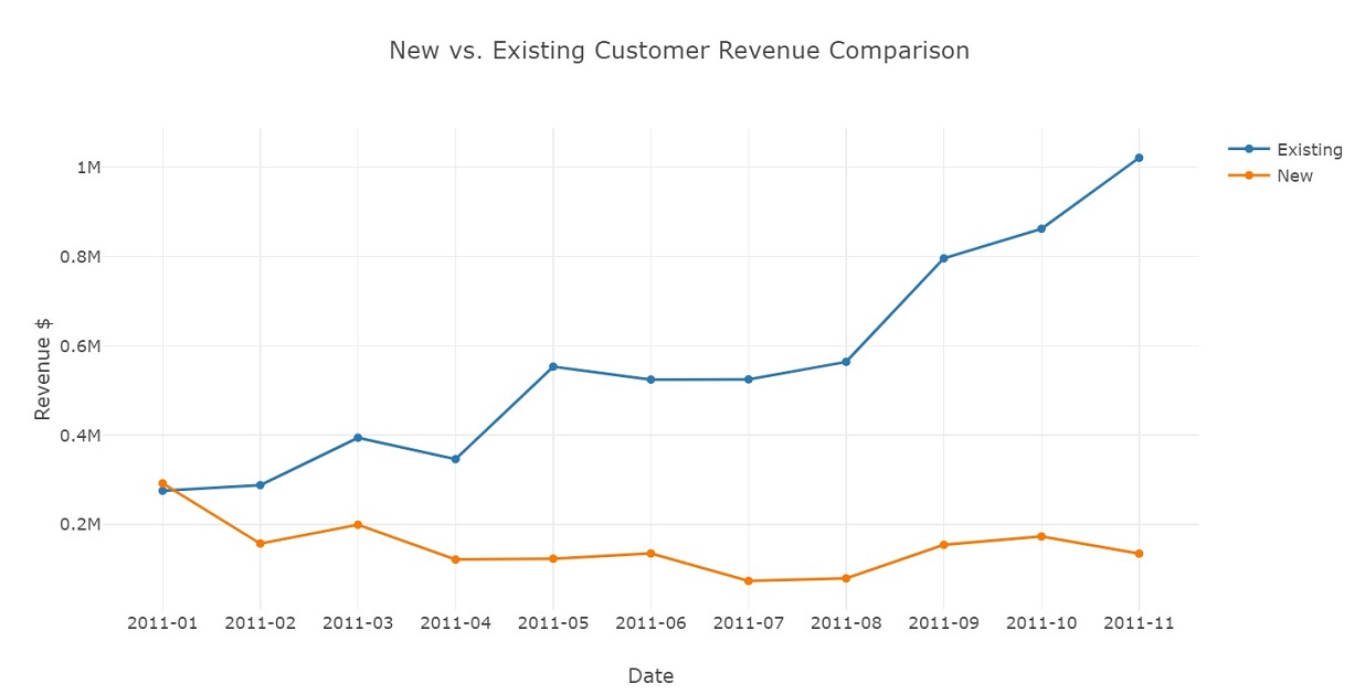
jCalculate new customer ratio and create a dataframe that shows new user ratio. Drop December 2011 data since it is incomplete, drop NA, and January 2011 since all the customers were new.
newUser_ratio = first_purchase.query("UserType == 'New'").groupby(['InvoicePeriod'])['CustomerID'].nunique() \
		/ first_purchase.query("UserType == 'Existing'").groupby(['InvoicePeriod'])['CustomerID'].nunique() \
		* 100
newUser_ratio = newUser_ratio.round().reset_index()
newUser = newUser_ratio.dropna().drop(customers.index[[1,12]])
newUser
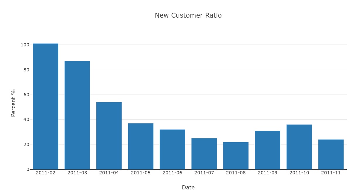
Graph new customer ratio by month. New customers are declining, but picked up a little in September.
ncr_data = [go.Bar(x = newUser['InvoicePeriod'], y = newUser['CustomerID'])]

plot_layout = go.Layout(xaxis = dict(title='Date', type='category'),
			yaxis = {'title':'Percent %'},
			title = 'New Customer Ratio')

fig = go.Figure(data = ncr_data, layout = plot_layout)
pyoff.iplot(fig)
To calculate cohort based retention rate. Identify which customer is active by looking at their revenue each month.
user_purchase = retail_data.groupby(['CustomerID', 'InvoicePeriod'])['Revenue'].sum().reset_index()
user_purchase.head()
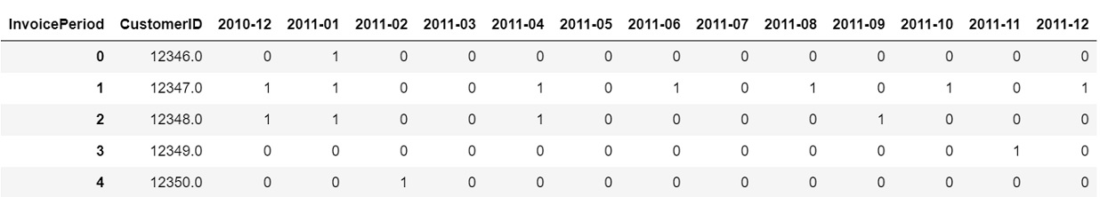
Create retention matrix with crosstab function which builds a cross-tabulation table that can show the frequency with which certain group appear.
retention = pd.crosstab(user_purchase['CustomerID'], user_purchase['InvoicePeriod']).reset_index()
retention.head()
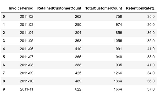
Create an array of dictionary which keeps retained & total customer count for each month and convert the array to dataframe. Then calculate retention rate.
months = retention.columns[2:]
retention_array = []
for i in range(len(months)-1):
	retention_data = {}
	selected_month = months[i+1]
	prev_month = months[i]
	retention_data['InvoicePeriod'] = (selected_month)
	retention_data['TotalCustomerCount'] = retention[selected_month].sum()
	retention_data['RetainedCustomerCount'] = retention[(retention[selected_month] > 0)
						  & (retention[prev_month] > 0)][selected_month].sum()
	retention_array.append(retention_data)

retention = pd.DataFrame(retention_array)
retention['RetentionRate%'] = retention['RetainedCustomerCount'] / retention['TotalCustomerCount'] * 100
retention_rate = retention.drop(retention.index[[10]]).round()
retention_rate
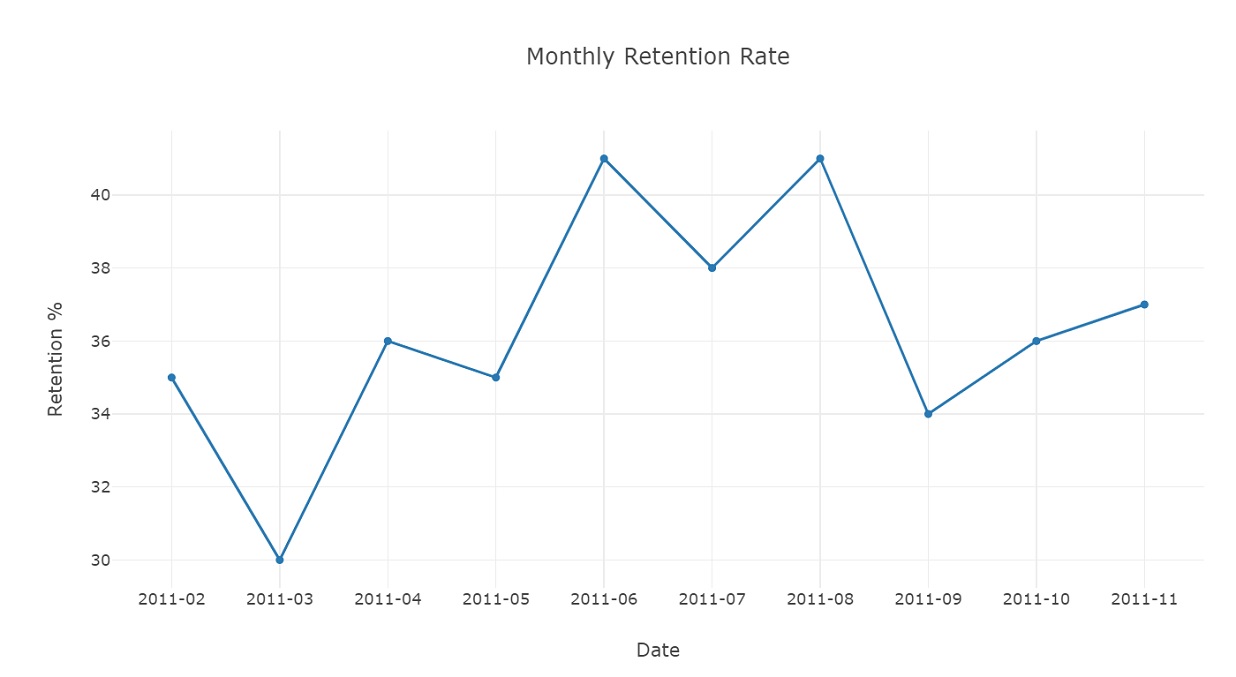
Graph retention rate. Retention rates has been growing with some lows that could be due to seasonality.
rr_data = [go.Scatter(x = retention_rate['InvoicePeriod'], y = retention_rate['RetentionRate%'])]

plot_layout = go.Layout(xaxis = dict(title = 'Date', type = 'category'),
			yaxis = {'title':'Retention %'},
			title = 'Monthly Retention Rate')

fig = go.Figure(data = rr_data, layout = plot_layout)
pyoff.iplot(fig)
Cohort month is the first month a specific customer shopped at this online retailer.
Cohort index is the month difference between invoice month and cohort month for each row.
Deduction allows you to know the month lapse between first transaction and the last transaction.
def get_month(x):
	return dt.datetime(x.year, x.month, 1)
retail_data['InvoiceMonth'] = retail_data['InvoiceDate'].apply(get_month)
retail_data['CohortMonth'] = retail_data.groupby('CustomerID')['InvoiceMonth'].transform('min')
def get_date(df, column):
	year = df[column].dt.year
	month = df[column].dt.month
	day = df[column].dt.day
	return year, month, day
invoice_year, invoice_month, _ = get_date(retail_data, 'InvoiceMonth')
cohort_year, cohort_month, _ = get_date(retail_data, 'CohortMonth')
year_diff = invoice_year - cohort_year
month_diff = invoice_month - cohort_month
retail_data['CohortIndex'] = (year_diff * 12 + month_diff + 1)

retail_data['CohortMonth'] = retail_data['CohortMonth'].map(lambda x: x.strftime('%Y-%m'))
retail_data.sample(5)
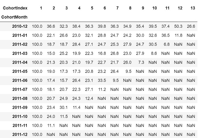
Group cohortmonth, cohortindex and customerid to a dataframe and using pivot table function to group into a two-dimensional table to provide multidimensional summarization of cohorts.
Indect is CohortMonth first column in the chart are active customers by a specific month following column show the percentage of returning custmers.
cohort_data = retail_data.groupby(['CohortMonth', 'CohortIndex'])['CustomerID'].apply(pd.Series.nunique).reset_index()
cohort_count = cohort_data.pivot_table(index = 'CohortMonth', columns = 'CohortIndex', values = 'CustomerID')

cohort_size = cohort_count.iloc[:,0]
retention = cohort_count.divide(cohort_size, axis = 0)
retention.round(3) * 100
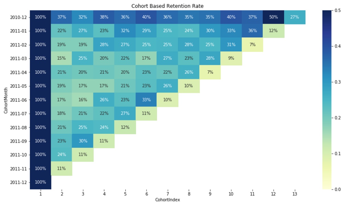
Graph a heatmap to show cohorts of the retention rate.
plt.figure(figsize=(15, 8))
plt.title('Cohort Based Retention Rate')
sns.heatmap(data = retention,
			annot = True,
			fmt = '.0%',
			vmin = 0.0,
			vmax = 0.5,
			cmap = "YlGnBu")
plt.show()
RFM is a customer segmentation technique that uses past purchase behavior to divide customers into groups.
RECENCY (R): Days since last purchase - Score of 1 goes to customers who bought most recently
FREQUENCY (F): Total number of purchases - Score of 1 goes to customers who placed the highest number of orders
MONETARY VALUE (M): Total money this customer spent - Score of 1 goes to customers who spent the most in terms of value
Some research indicats that customer clusters vary by geography, so this analysis will be focus on United Kingdom customers since it is the largest.
uk_data['Revenue'] = uk_data['Quantity'] * uk_data['UnitPrice']
uk_data.sample(5)
Calculate RFM values by grouping the data for each customer & aggregate it for each recency, frequency, and monetary value, then rename the columns.
uk_data['InvoiceDate'] = pd.to_datetime(uk_data['InvoiceDate'])
NOW = dt.datetime(2011,12,10)
rfm = uk_data.groupby('CustomerID').agg({'InvoiceDate' : lambda x: (NOW - x.max()).days,
'InvoiceNo' : 'count', 'Revenue' : 'sum'})
rfm.rename(columns = {'InvoiceDate' : 'Recency', 'InvoiceNo' : 'Frequency', 'Revenue' : 'Monetary'}, inplace = True)
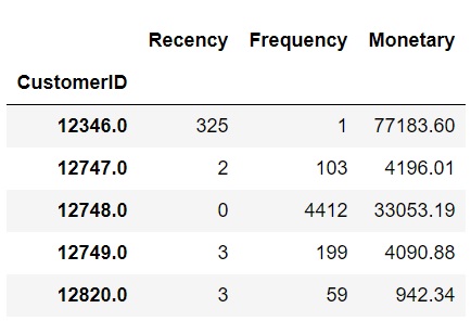
rfm.head()
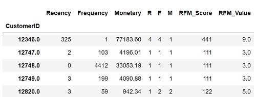
Cause these are continuous values, we can use the quantile values and divide them into 4 groups create labels and assign them to percentile groups.
Use qcut() to put variable into equal-sized bins. Make a new column for group labels and total the sum of the three values to get RFM_Value
r_labels = range(1, 5)
f_labels = range(4, 0, -1)
m_labels = range(4, 0, -1)

r_groups = pd.qcut(rfm.Recency, q = 4, labels = r_labels)
f_groups = pd.qcut(rfm.Frequency, q = 4, labels = f_labels)
m_groups = pd.qcut(rfm.Monetary, q = 4, labels = m_labels)
rfm['R'] = r_groups.values
rfm['F'] = f_groups.values
rfm['M'] = m_groups.values

rfm['RFM_Score'] = rfm.apply(lambda x: str(x['R']) + str(x['F']) + str(x['M']), axis = 1)
rfm['RFM_Value'] = rfm[['R', 'F', 'M']].sum(axis = 1)
rfm.head()
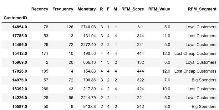
RFM_Value can be used to categorize customers assign labels from total score.
score_labels = ['Best Customers', 'Loyal Customers', 'Big Spenders', 'Almost Lost', 'Lost Customers', 'Lost Cheap Customers']
score_groups = pd.qcut(rfm.RFM_Value, q = 6, labels = score_labels)
rfm['RFM_Segment'] = score_groups.values
rfm.sample(10)
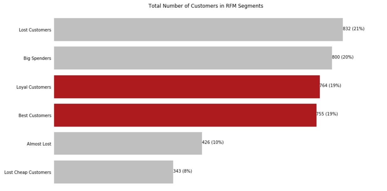
Graph each RFM Segment. 38% of customers are either loyal or the best customers. There are 21% of lost customers who can now be identified and retarget with a come back campaign.
segment_counts = rfm['RFM_Segment'].value_counts().sort_values(ascending=True)

fig, ax = plt.subplots(figsize=(13, 8))

plt.title('Total Number of Customers in RFM Segments')

bars = ax.barh(range(len(segment_counts)), segment_counts, color='silver')

ax.set_frame_on(False)

ax.tick_params(left=False, bottom=False, labelbottom=False)

ax.set_yticks(range(len(segment_counts)))
ax.set_yticklabels(segment_counts.index)

for i, bar in enumerate(bars):
	value = bar.get_width()

	if segment_counts.index[i] in ['Best Customers', 'Loyal Customers']: bar.set_color('firebrick')

	ax.text(value, bar.get_y() + bar.get_height()/2,
		'{:,} ({:}%)'.format(int(value), int(value*100/segment_counts.sum())))

plt.show()
Using UK revenue rename the columns to ds and y in order to comply with the Prophet API
uk_revenue = uk_data.rename(columns = {"InvoiceMonth" : 'ds', "Revenue" : 'y'})
uk_revenue.shape
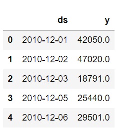
uk_revenue.head()
Check tail of future to ensure the prediction dates are 180 days out.
model = Prophet(yearly_seasonality=True, weekly_seasonality=True, daily_seasonality=True)
model.add_country_holidays(country_name='UK')
model.fit(uk_revenue)
future = model.make_future_dataframe(periods = 180)
future.tail()
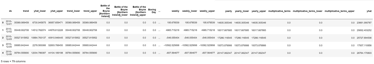
Predict method to make future predictions. This will generate a dataframe with a yhat column that will contain the predictions.
forecast = model.predict(future)
forecast.head()
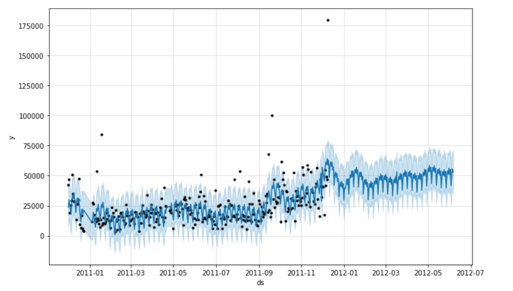
Plot forcast. Blue line represents the predicted values shaded blue area is the error of the forecast and the black dots represents the data in dataset.
plot2 = model.plot(forecast)
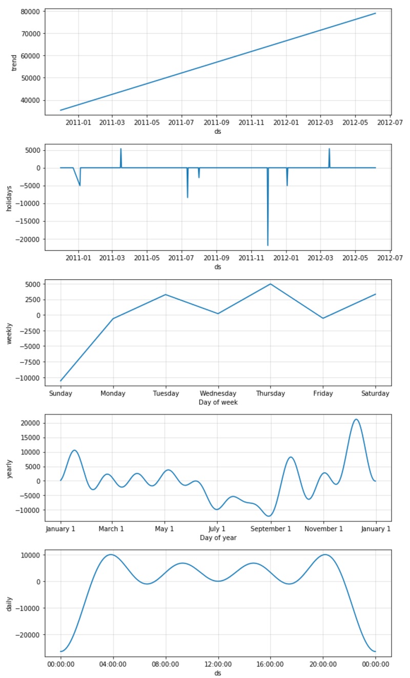
Plots the trend, yearly, weekly and daily seasonality.
plot3 = model.plot_components(forecast)
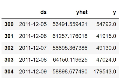
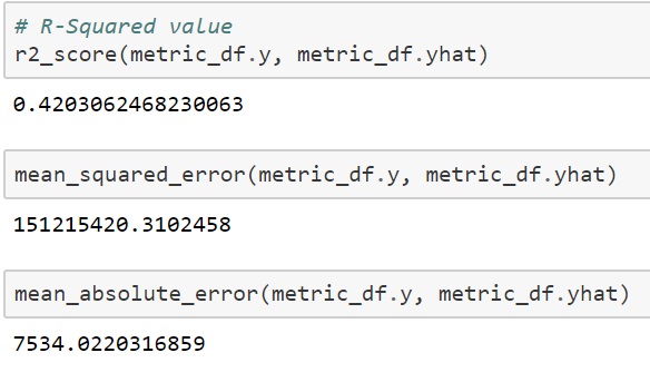
Create a metric dataframe to measure accuracy of model. This dataset is not ideal for timeseries modeling.
metric_df = forecast.set_index('ds')[['yhat']].join(uk_revenue.set_index('ds').y).reset_index()

metric_df.dropna(inplace=True)
metric_df.tail()